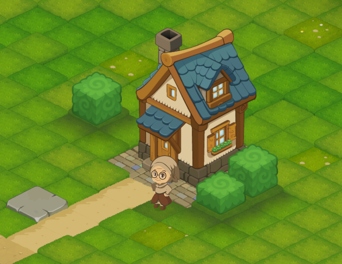
When I started working on the visual direction of Luni, I already had a few ideas I did not want to compromise on. By that point, I had also spent roughly a year sketching ideas on paper and trying to understand what kind of world I wanted to build.
I already had a fairly clear picture in my head. I wanted an isometric world with a strong sense of shape and personality, easy to read during gameplay, but still detailed enough to make exploration feel interesting and rewarding. The difficult part was turning those ideas into something that could work consistently across the whole game.
Art #1: Finding the Visual Direction of Luni
Finding Luni's visual style meant balancing readability, personality and the realities of building an RPG as a solo developer. Here's a small look at how that direction gradually took shape.
By Andrei Alexandru4 min read
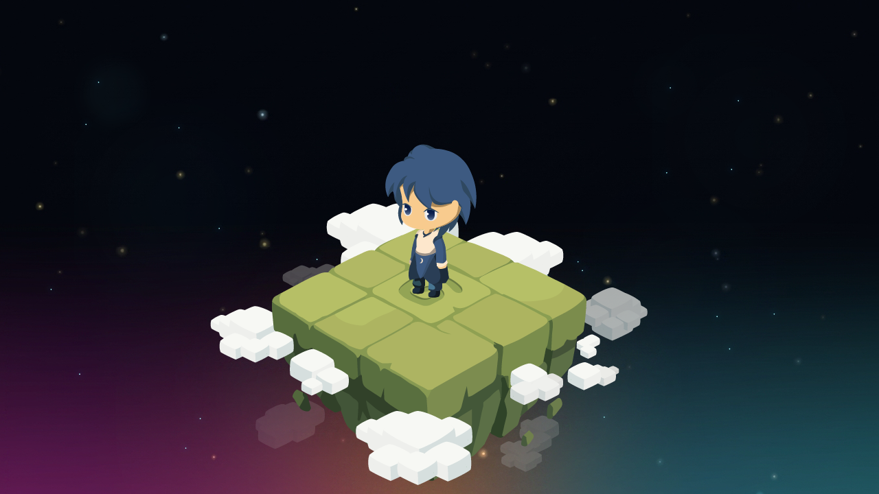
Finding the balance
Because Luni is being developed by one person, alongside a full-time job, time has always been part of the equation. Whatever visual direction I chose had to be something I could realistically carry across an entire RPG. One house quickly becomes several houses, then roads, vegetation, props, characters, resources, interiors, effects and all the small things that make a world feel alive.
So I couldn't think only about what looked good. I also had to think about how long things took to make and whether the same approach would still work hundreds of assets later. I wanted enough variation and detail to give the world personality, without choosing a style that would become impossible to maintain.
Looking at the game from the player's distance
That also changed the way I looked at detail. I started paying much more attention to silhouettes, contrast, proportions and what was actually visible from the normal gameplay camera.
Some elements became simpler, while others needed stronger shapes to stay recognizable. Details that looked great while zoomed in sometimes almost disappeared once they were placed in the game. Other things that initially felt exaggerated made much more sense when seen at the actual size the player would experience them.
Over time, I stopped looking at each asset as a drawing on its own and started judging it by how well it worked as part of the world around it.
Finding the visual direction of Luni
The art direction did not appear all at once. It slowly took shape through many small experiments. A building could introduce an idea that worked well. A plant could show me that something needed to be simplified. A new environment could suddenly make an older asset feel too detailed, too flat or simply out of place. Each new piece gave me something to compare against what was already there. Little by little, certain decisions started becoming consistent. Shapes became clearer, the amount of detail became easier to judge, and colors, materials and shadows started feeling like they belonged to the same world. There are still things that will evolve as development continues, and I expect that to remain true for a while. But the process now feels less like searching for a style from scratch and more like refining something that has gradually become recognizable as Luni.
Building a world, not just individual assets
One of the biggest lessons for me has been that the visual direction has to work beyond a single screenshot or a single asset. Everything eventually has to live together in the same world. It needs enough personality to make Luni recognizable, enough clarity to work during gameplay, and a production process that is realistic for one person to sustain. Those goals do not always point in exactly the same direction, so a lot of the work has been about finding the right balance without losing the ideas that mattered to me from the beginning. The image above is only a small glimpse of where that process has led so far.
There is much more of Luni's world that I am keeping out of sight for now.